Monday, November 30, 2009

Simple


Sometimes less is more. This is an example of a really simple, but strong design. I like that there isn't any actual design in it (minus layout and composition), but it still reflects what design is and can be.

Monday, November 23, 2009

TIM'S BOARD GAMES!!!!!

The games that have influenced my board game are The Great Train Robbery Board Game, Chess and Checkers.


Board Games!


These are the Board Games that I am drawing my inspiration from.


the three games that i chose as references to my board game are candy land, chutes and ladders and madagascar 2: escape 2 africa.


Game Influences

Three games that influenced my design are Life, Chutes and Ladders and Monopoly. They all contributed to the general layout and concept of my game. The most influential one was Chutes and Ladders.

Board Game

Trouble, Sorry, Shutes and ladders

Sunday, November 22, 2009

Influential Board Games

Three games that I love to play and have also had an influence in the concept of my game are:
1. Monopoly (time and money)
2. Sorry (movement and direction; some concept)
3. LIFE (layout, 3D peices)

Wednesday, November 18, 2009

design problem

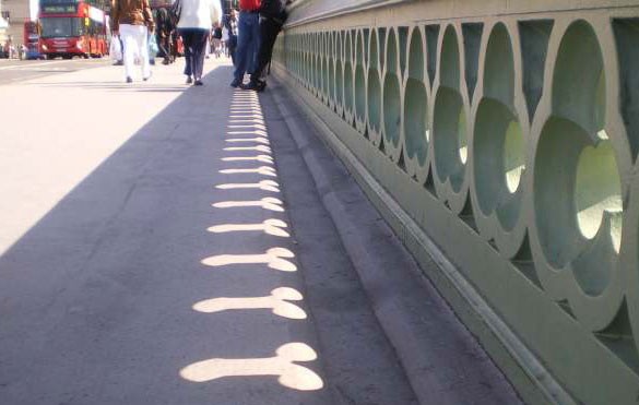
While I am sure the tri circle design in this walkway wall looks good at a direct view, unfortunately at certain times of the suns rising or setting the pattern creates an interesting shadow. I find this amusing but I am sure the person who designed the pattern didnt imagine to account for the shadows cast durring the day.

Sunday, November 15, 2009

Shadow Puppets gone bad

This is an interesting use of shadows. The shadows are distorted and much larger than the real ones and it exaggerates the impending doom.

Tuesday, November 10, 2009

Candy


I found this image when doing some research and I liked this ad because it felt sorta retro and modern. The use of dots as the main title and background gives the eyes a sort of dancing around feeling when looking at this ad. The eyes dont stay at one focal point because if there should be a focal point it would have to be the word "Candy" but since the background are the same sized dots the eye just dances all over this image.

Monday, November 9, 2009

Graphic Design Winner


ok i just wrote a big ole paragraph about this poster and it decided to delete itself, so...yeah. just look at it, it's pretty.
It's a contest winner.

Other winners here.

Saturday, November 7, 2009

VGL SWM looking for a NSA DDF BiFWB

oh yea. my 6 additional "personalities" are:

I have a bad sense of humor

I went back to the future

I am an alcoholic

I just PWNed your ass!

I'm a little teapot

and.... (drum roll please)

I like long walks on the beach, fine dining and I've never been kissed.

Sandy Skoglund is an American photographer and installation artist. Skoglund creates surrealist images by building elaborate sets or tableaux, furnishing them with carefully selected colored furniture and other objects, a process of which takes her months to complete. Finally, she photographs the set, complete with actors. The works are characterized by an overwhelming amount of one object and either bright, contrasting colors or a monochromatic color scheme.


Thursday, November 5, 2009

1) I work on cars
2) I need a drink
3) I am a tattoo
4) Not here right now, leave a message
5) A gangster rapper
6) my life revolves around facebook

Wednesday, November 4, 2009

Name Tags

Hello, My name is Caitlin...

... and I love to dance!
... and I am out of control
... and I want to fly
... and I get money
... and I go to the Hogwart's School of Witchcraft and Wizardry
... and I am in love with Edward Cullen

Tuesday, November 3, 2009

Typoholic


This image is interesting for many reasons. The reason that I have chosen to publish it here is because I both like it and I don't like it. First I really like the use of text as an image. By changing the density and colors of the text the artist has created the main text of Typoholic in a very interesting way. The actual use of text is a very nice treatment of the design.

The reason that I find this image annoying is that I feel the black line across the bottom and the black image of a person are too heavy for the rest of the image. To me these aspects of the image just do not fit together.

Monday, November 2, 2009

Six Personalities

This is Brittany C writing on Kirsten's because my blog still won't work...

My final 6 are...
I am a twin
I am a Rockette
I am always texting
I am married to Justin Timberlake
I am loud
I am a leopard

My committment

I am spider man
I am smoking
I am good
I am evil
I am a machine
I am biological

Yaaaaaa


I found this image one someones website and they had a lot of other similar works of art that involved taking human limbs and re-arranging them in weird positions. I liked this piece of work because of the elegance and simplicity but when I looked closer to the image I saw a flaw in the design and that is the misuse of another arm that doesn't fit with the main figure. The arm below seems to be from another person specifically a man. It doesn't fit well, and I am not sure if this was done on purpose or if this was done because of limited resources of images. But it ruins the image, other then that simple flaw, I like the overall image.

6 ideas final

Jokester
Flexible
Hyper
Sneaky
Hungry
Liger

-Devin Sherin-final

Extra 6 Name tag ideas...

1. Prisoner
2. taxi Driver
3. Adventurer
4. Out of this world
5. barber
6. Grouch

Operation

I found this advertisement for Neosporin to be humorous. They took an old favorite board game that everyone knows and "fixed" him. In the board game it is the players job to fix the man, but neosporin did it for him. It is a clever use of a well known object.

Mother natures graphic design

This image is a representation of "mother natures graphic design". I found this image while doing research on our 12 personalities project. It was amazing to me how one animal could be so many different colors.

David Carson NIN cover

This cd cover for Nine Inch Nails "the fragile" was designed by world renowned typographer and designer David Carson. He pushes the limits of legibility and in his designs this creates interest. On the front the bands name is not fully visible, the text on the back is small and secondary but still clear enough to make out. That is where the interest and boundary pushing in his designs appeals to me.

How Ironic

This week I decide to go random with this post, but turns out I found something that perfectly reflects events that recently have transpired (hey, typography class.) Anyway, not only is this a well designed poster, it has a message that I think every artist NEEDS to live by.

All of the text reads like this:

"Graphic Design is about doing it right.
Except when you know that your eyeball is seeing something that just looks frigging right!!! Despite what a dumb book or professor might say - so what if they disagree... Who cares? Sometimes you just have to listen to your intuition & your ARTISTIC GUT. (You do have one, right?) Trust it."


Google> Flickr> Entry by artist for graphic design contest.

Sunday, November 1, 2009


I chose this interesting architecture piece because it caught my eye. The height and design of the metal looks like it took careful planning to build it. This is in Seattle Wash. The only reason I really chose it was because it looked awesome.